-
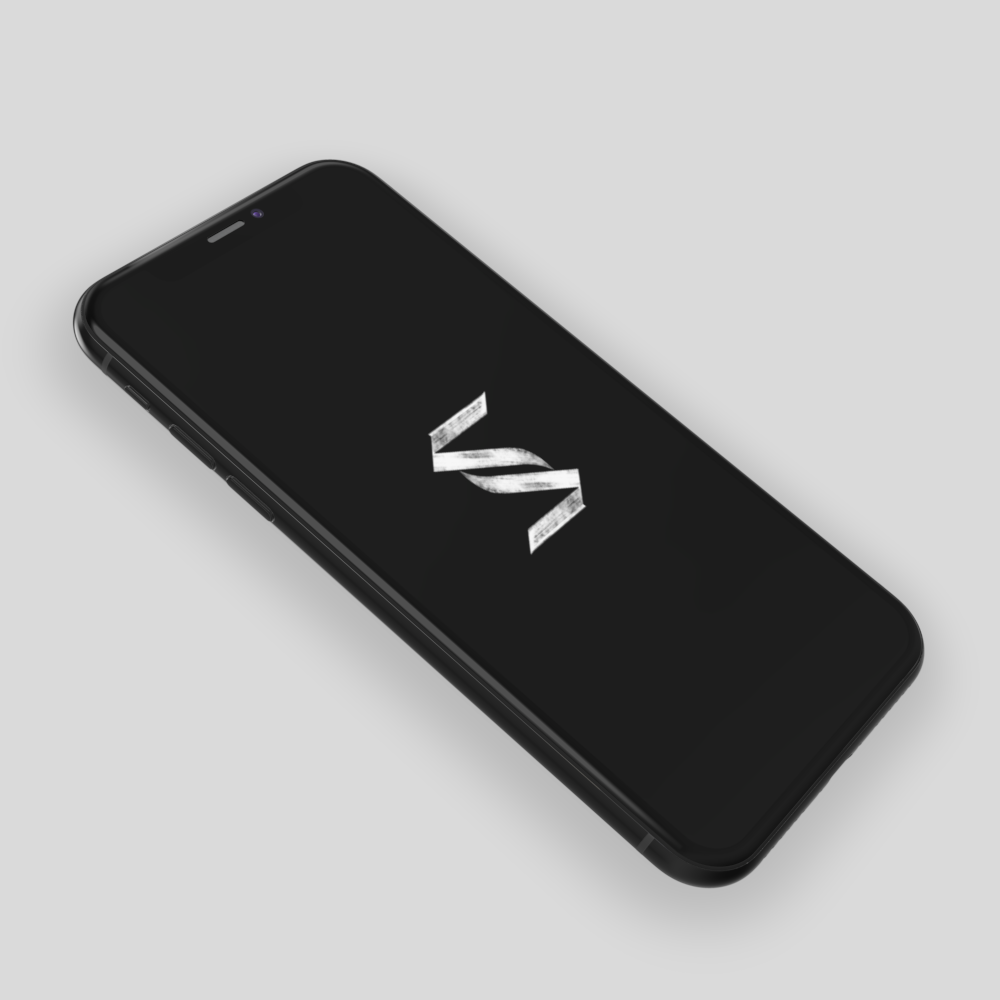
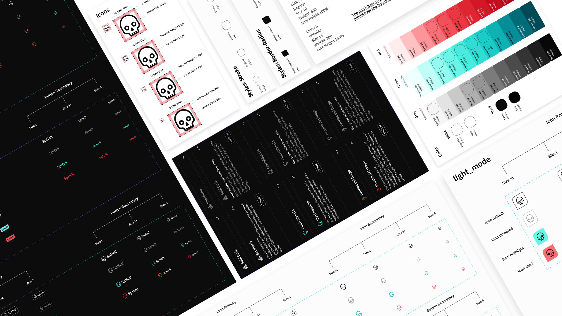
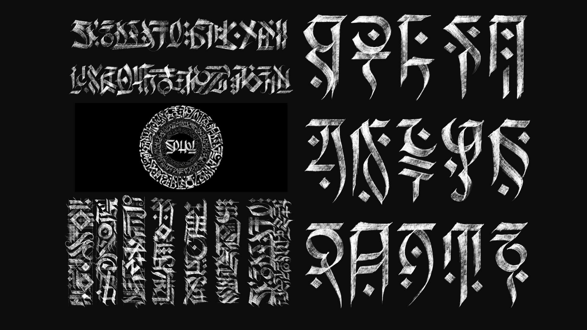
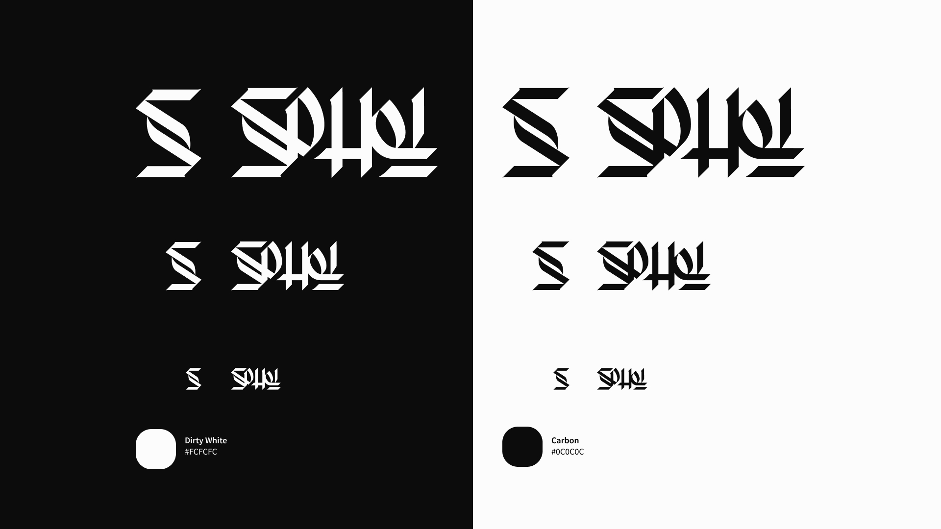
SpHell
video prototype: https://youtu.be/bOCXgndpzTI video illustration: https://youtu.be/wQhqqKYwk2I SpHell is a mobile multiplayer game based on investigation dynamics with the extra function of customizable adventures. The design system is based on atomic design structure and the brand has been created through a calligraphic process. Here the Figma project. Sphell © 2021 by Bruno Caruso is licensed under Attribution-NonCommercial-NoDerivatives 4.0 International -
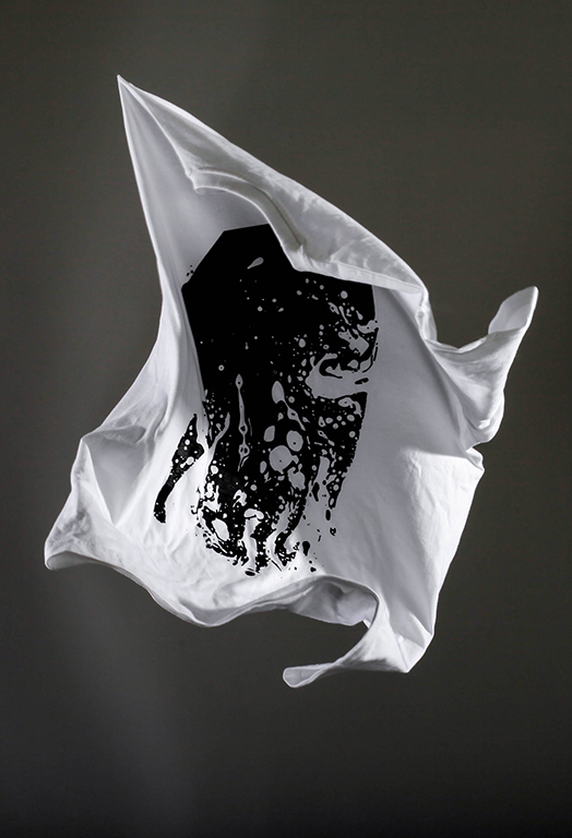
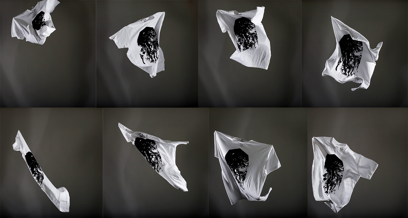
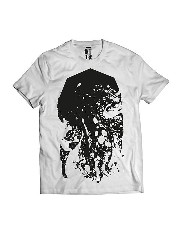
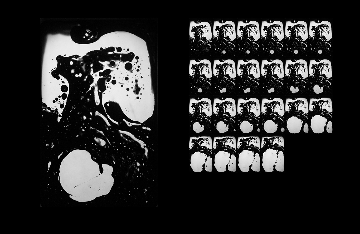
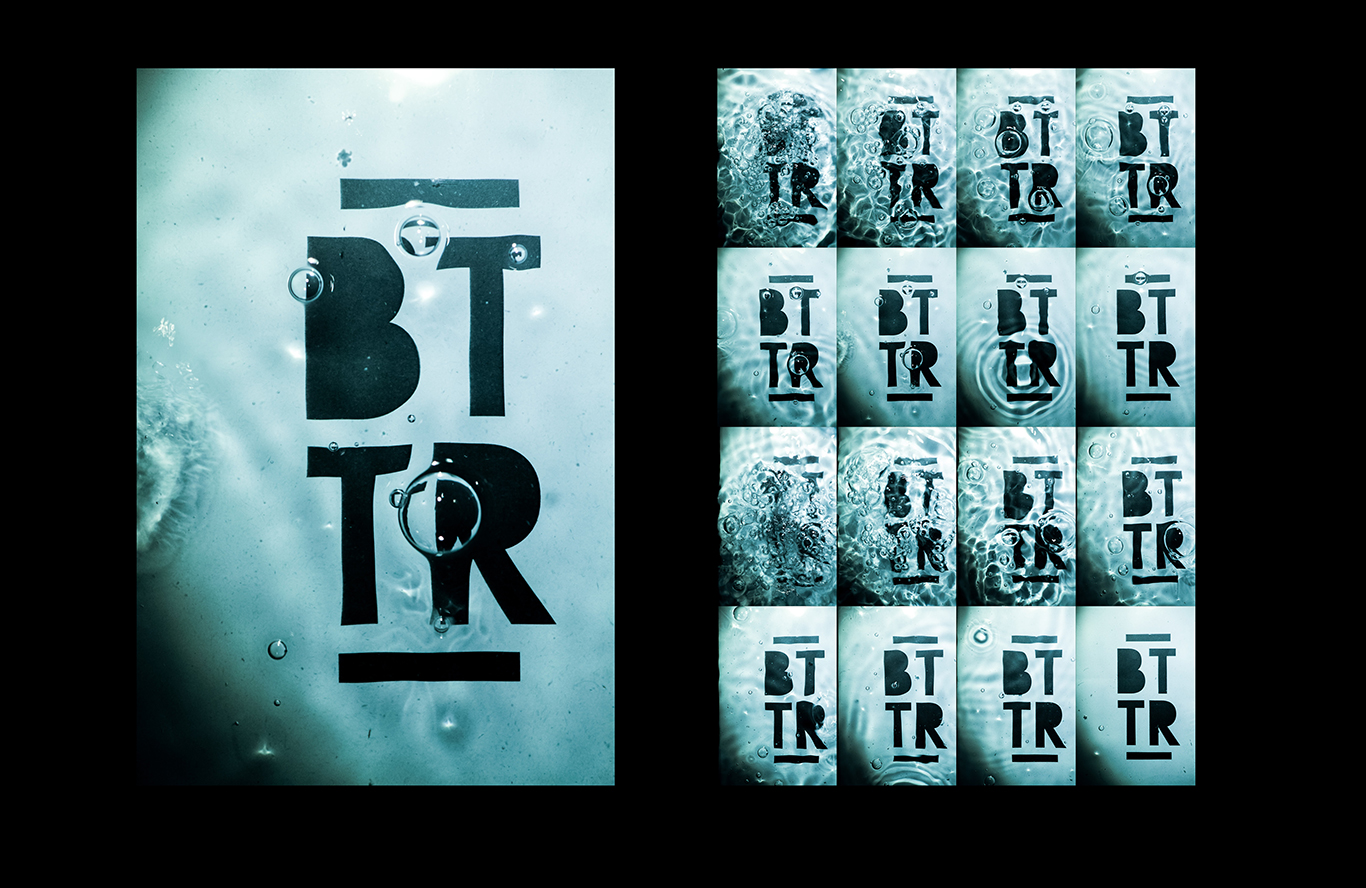
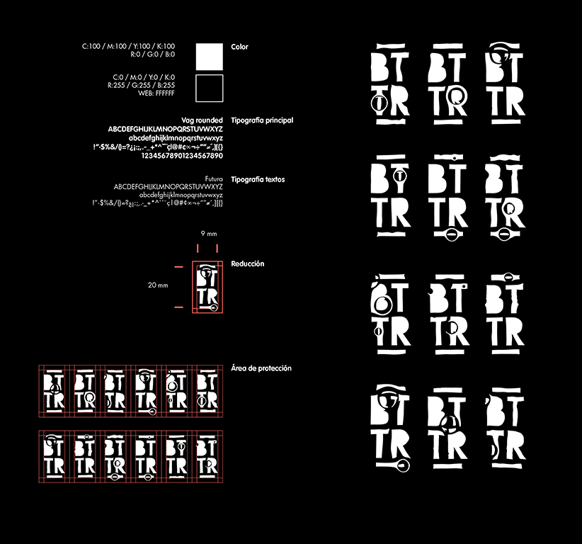
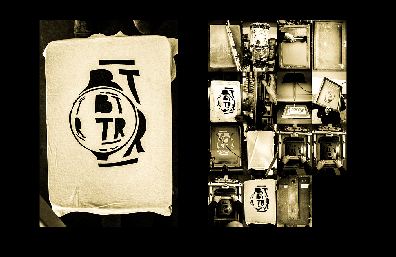
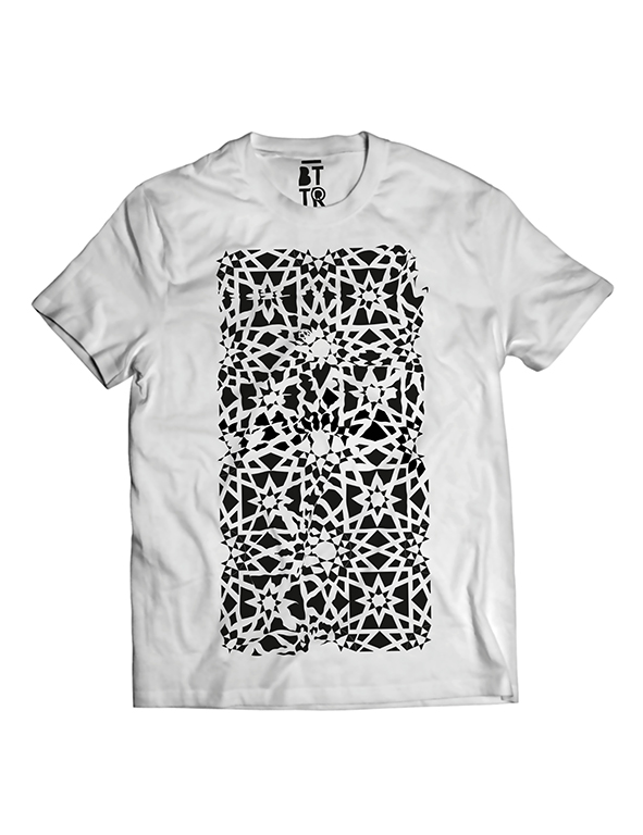
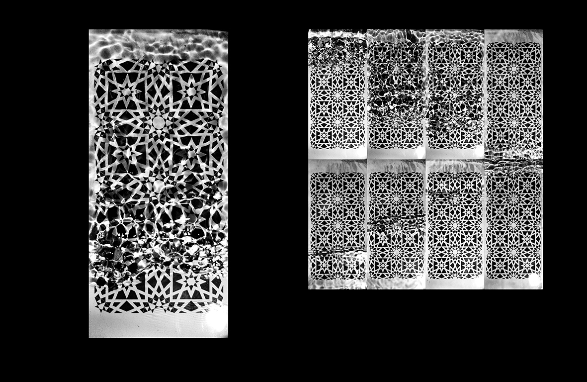
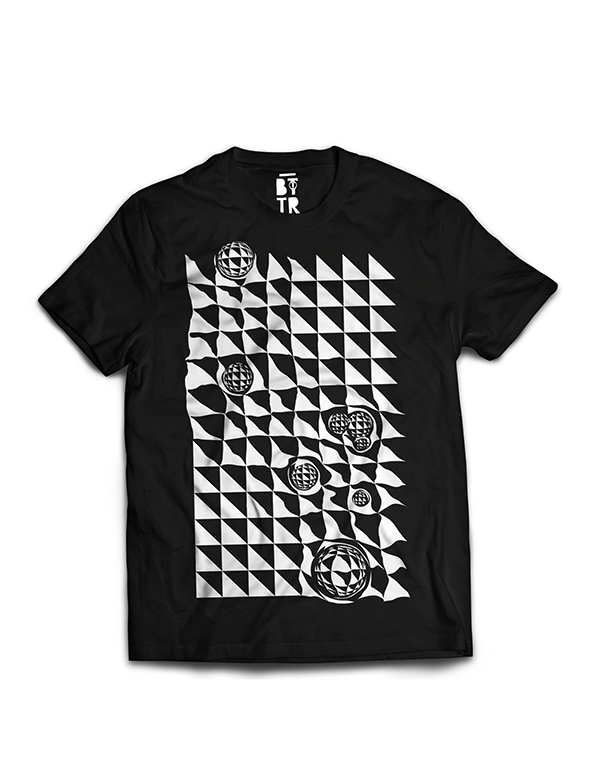
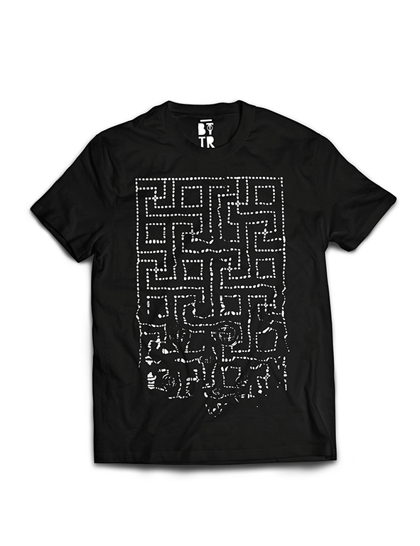
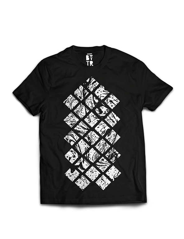
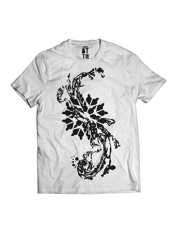
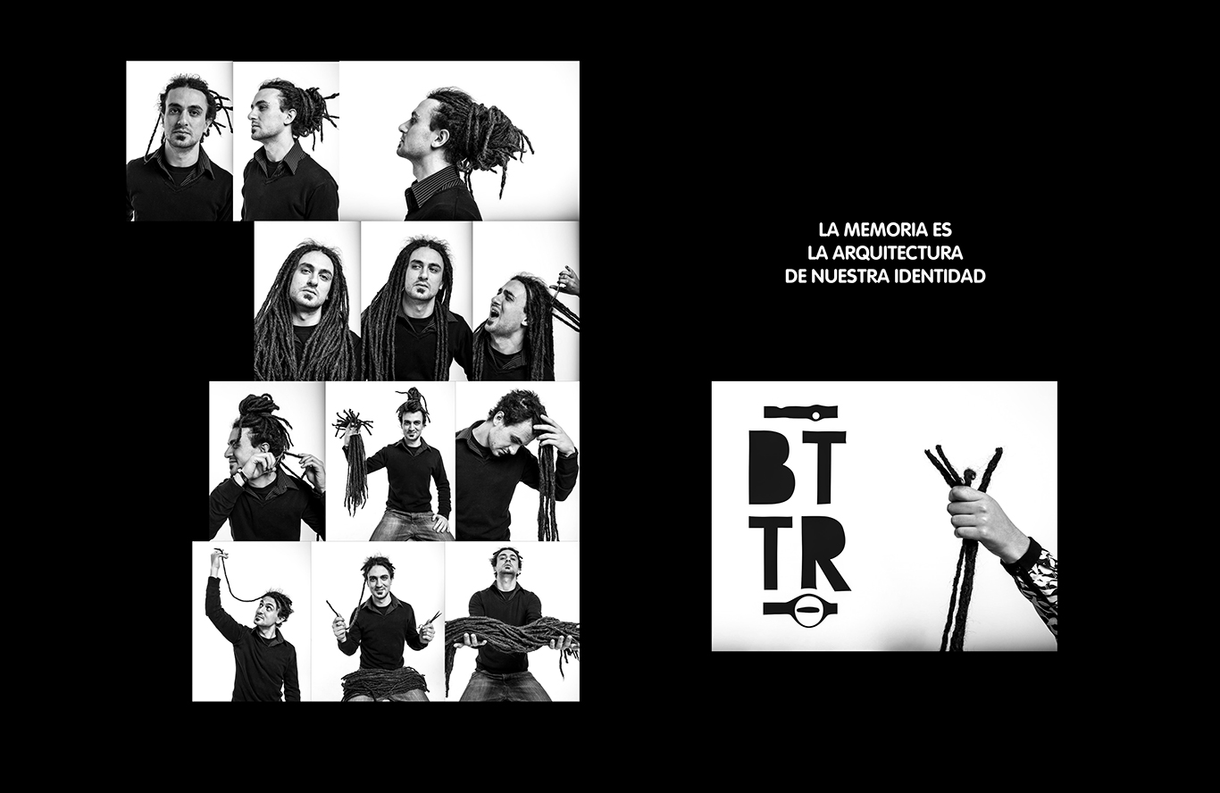
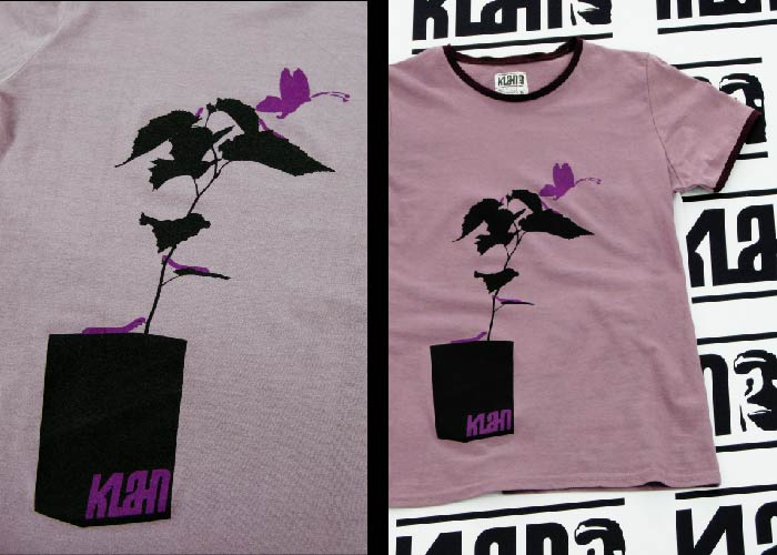
Back To The Roots
Back To The Roots is a final degree project realized at the EASD Valencia. Is a collaboration with the brand www.siculamente.it with the aim of creating a cultural and commercial response to the need for a product that would represent the multicultural roots of the Mediterranean in the Sicilian culture. The project consists of a brand of T-shirts made by silk screen and publicized through a web 2.0. Audiovisual viral want materials to promote a cultural concept over to foment interest in the brand. Design is based on experimentation on water which represent the principal element for memory. www.bttr.it -
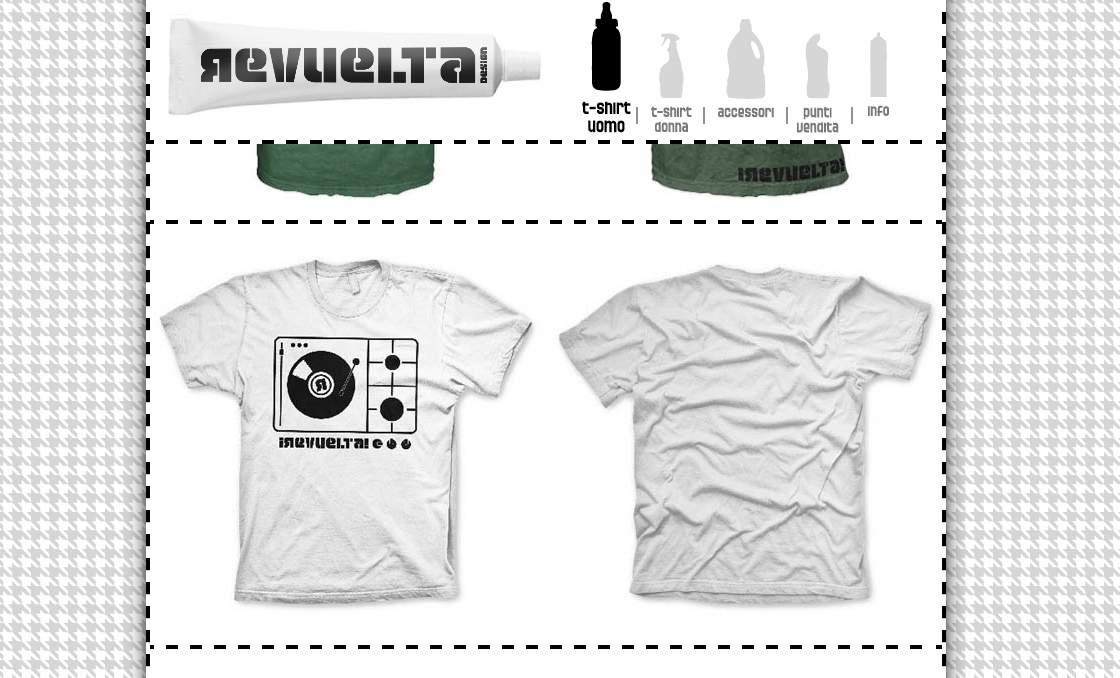
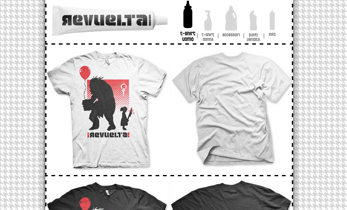
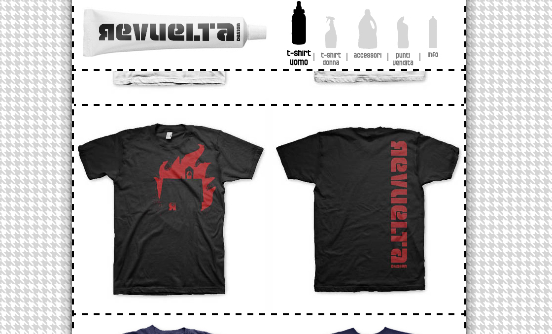
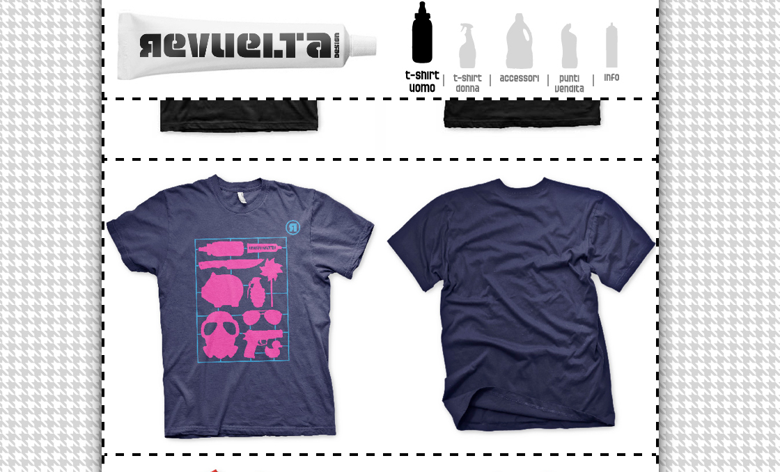
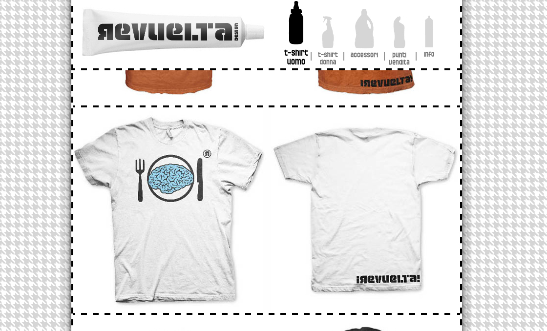
Revuelta
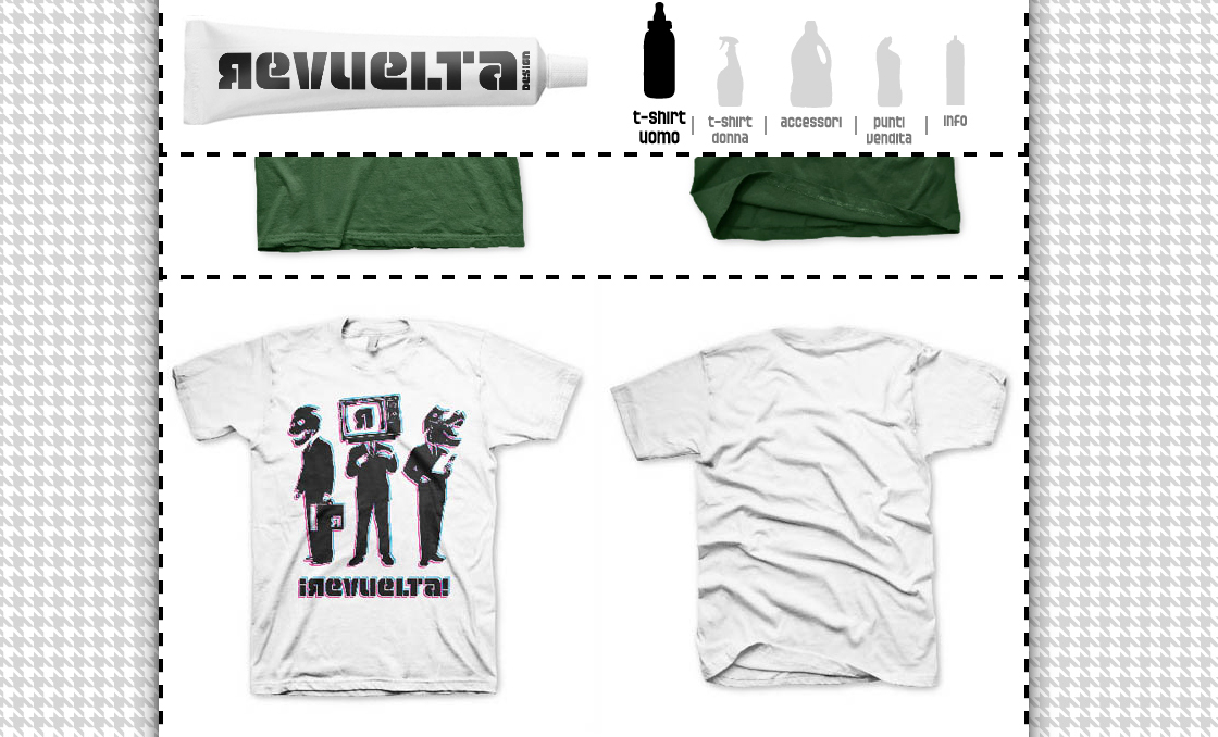
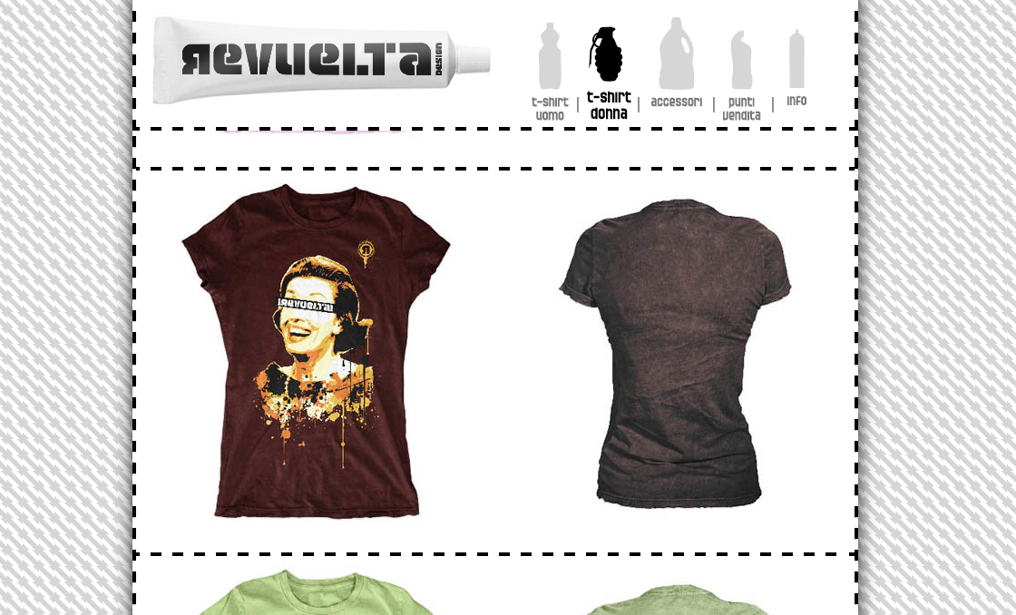
Revuelta is a brand of t-shirts mad e in Ragusa (Italy). Aimed at a young public between 15 and 25 years, whose iconography is based on the critique of the West socio-political and consumerist. The printing technique used is screen printin g on t-shirts of medium-high quality. It has been made the design of the brand, the t-shirt collection, website, and promotional materials such as brochures and posters printed.- logo
- Captura-de-pantalla-2012-04-04-a-las-11.45.50
- Captura-de-pantalla-2012-04-04-a-las-11.45.39
- Captura-de-pantalla-2012-04-04-a-las-11.46.03
- Captura-de-pantalla-2012-04-04-a-las-11.46.06
- Captura-de-pantalla-2012-04-04-a-las-11.46.21
- Captura-de-pantalla-2012-04-04-a-las-11.49.29
- Captura-de-pantalla-2012-04-04-a-las-11.50.01
-
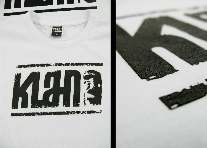
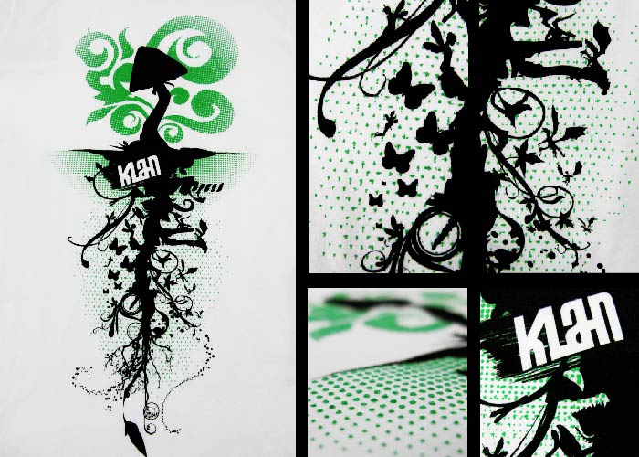
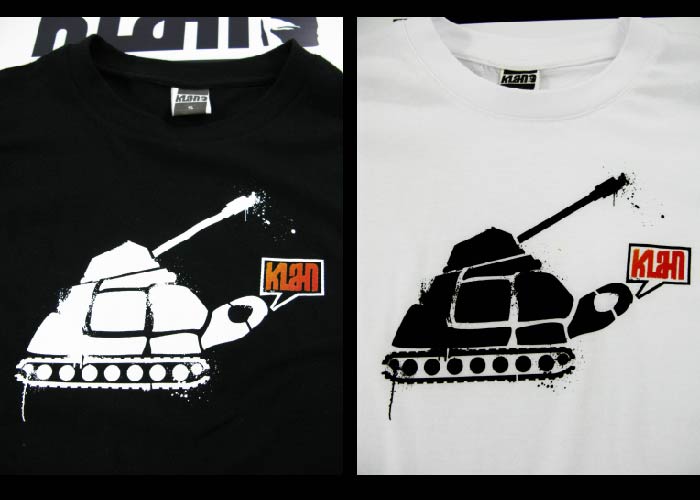
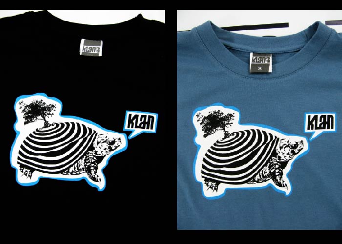
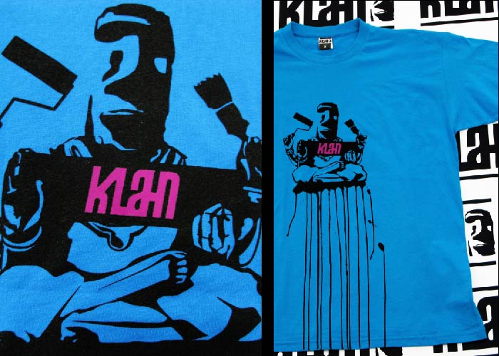
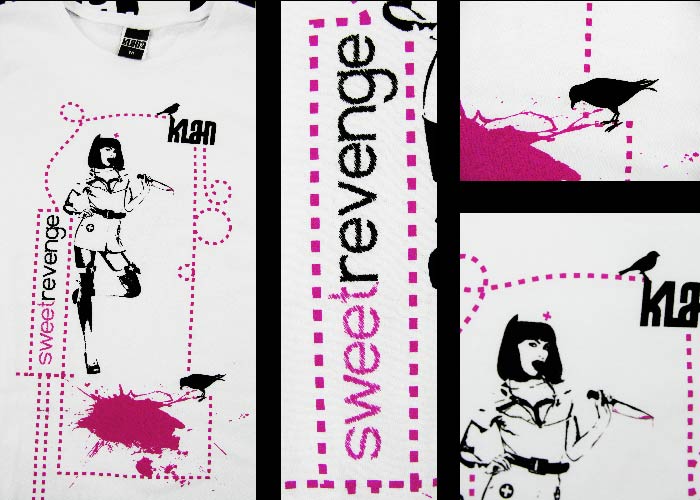
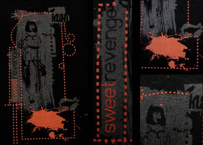
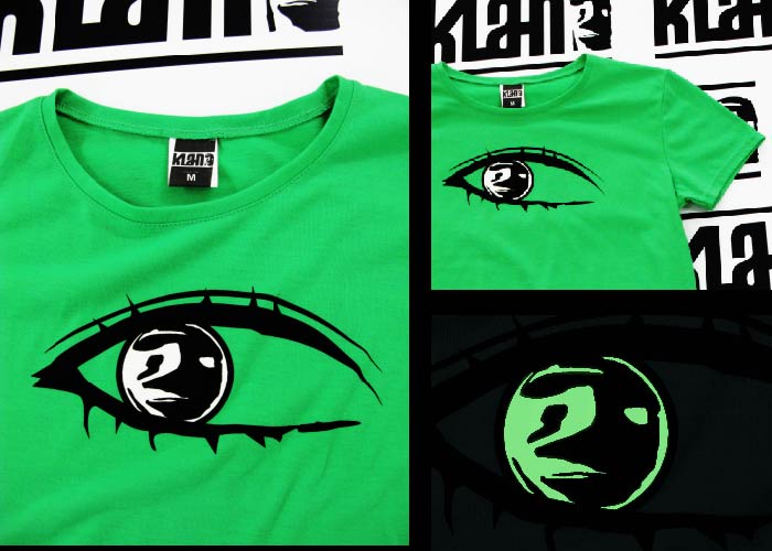
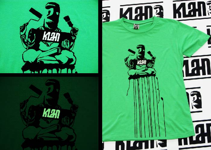
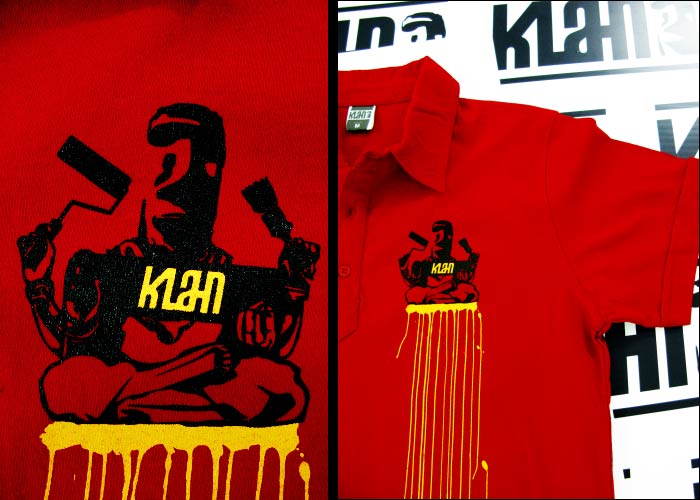
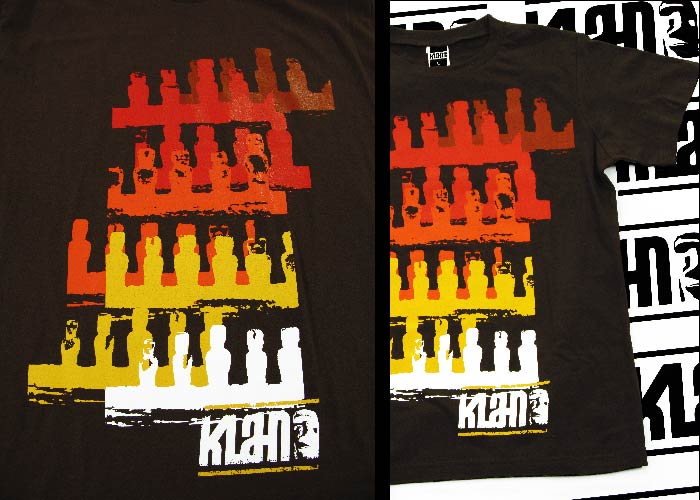
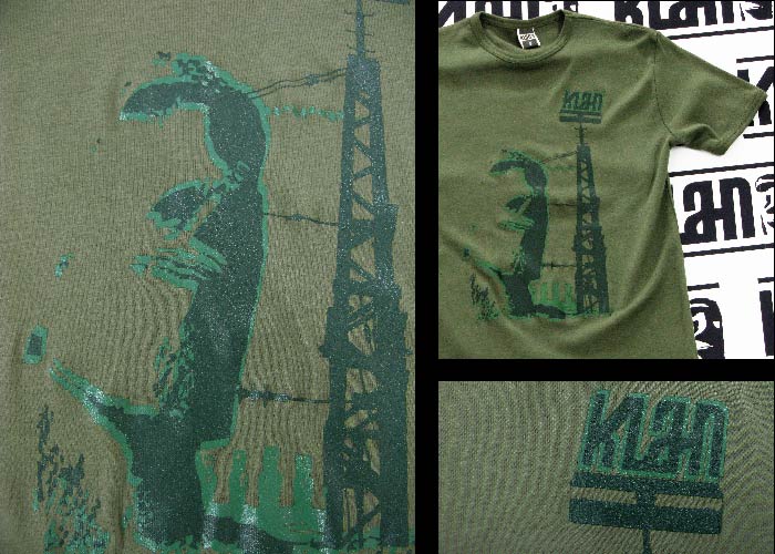
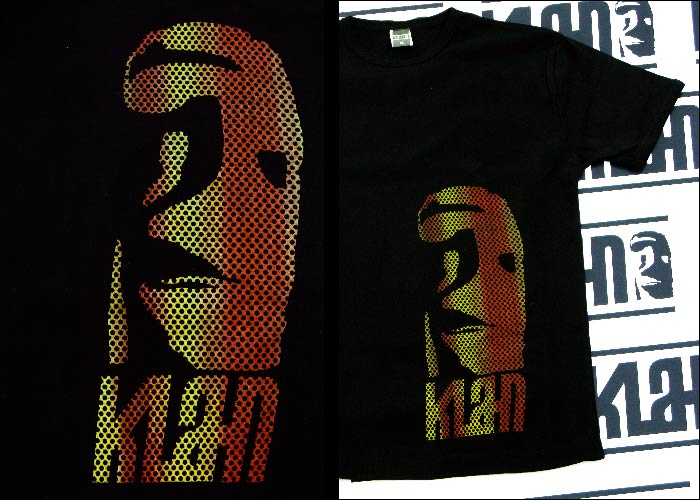
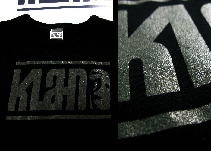
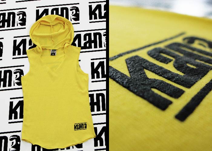
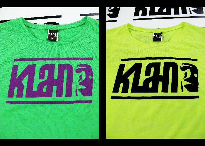
Klahn
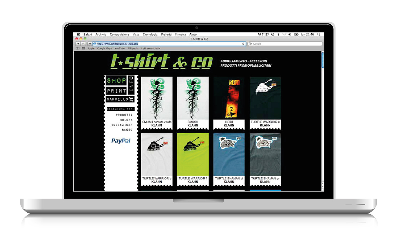
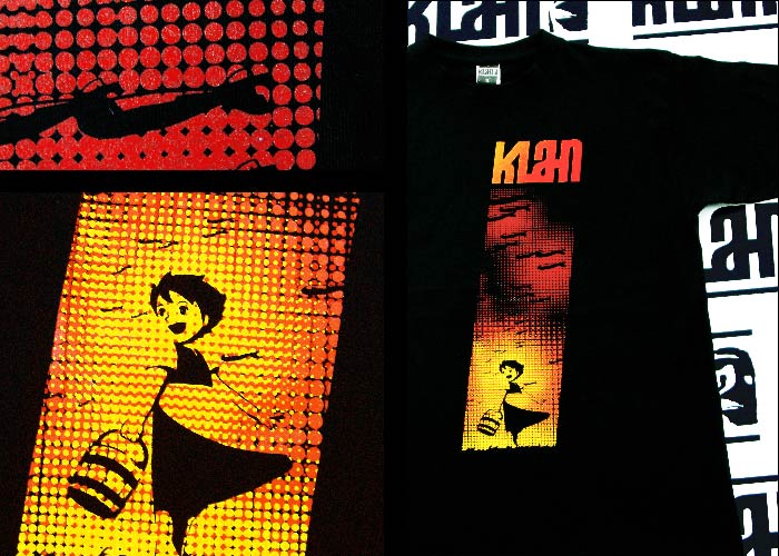
“Klahn” is a t-shirt collection, made in collaboration with an Italian company in Victoria (Italy), for a target between 15 and 30 years. The brand’s design is inspired by the concept of a tribe, a clan, and the t-shirts are in fact the most appropriate media to “wear” an identity and identify with something, and at the same time communicate this to other people. I’ve realeased the design of the brand, the t-shirt collection, website, and promotional materials such as brochures and posters printed. -
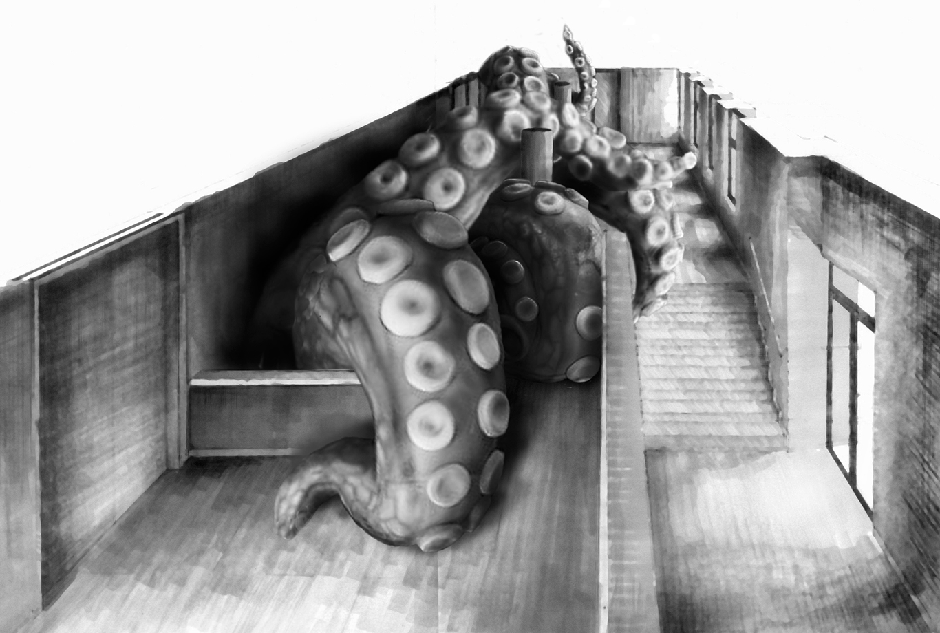
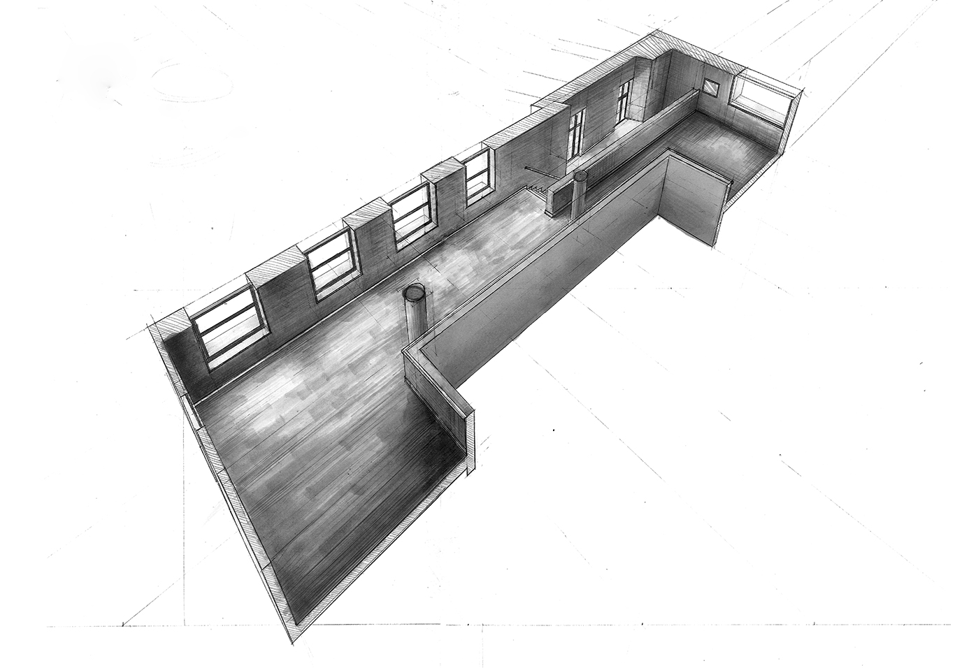
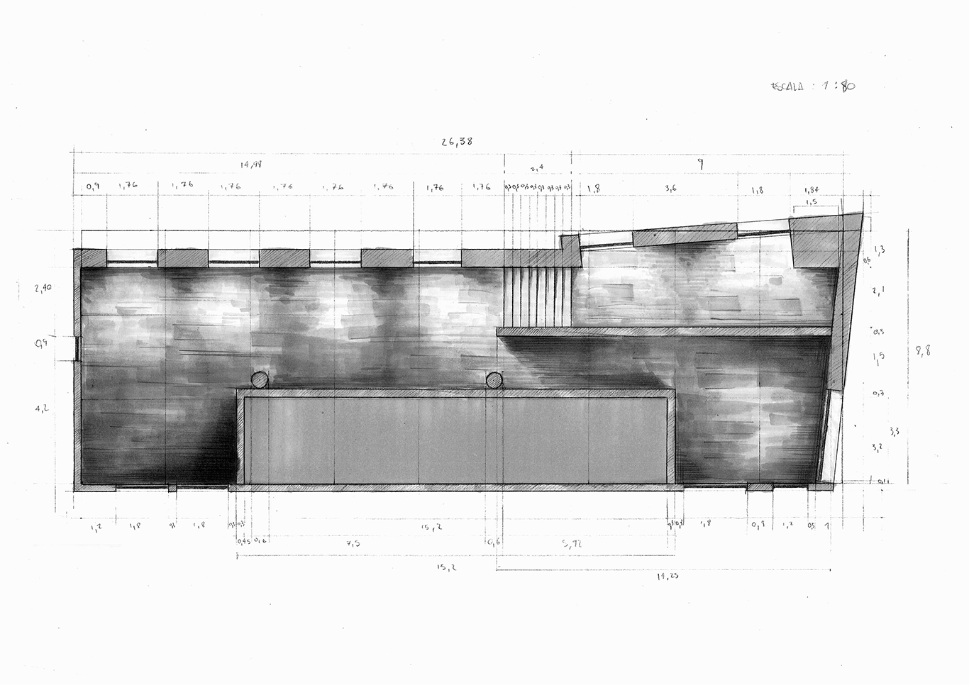
Space
Studio on interior space according to the differents perspectives and his application of the illustration. // EASD Valencia. -
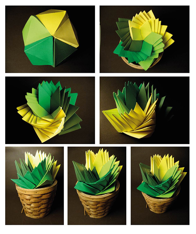
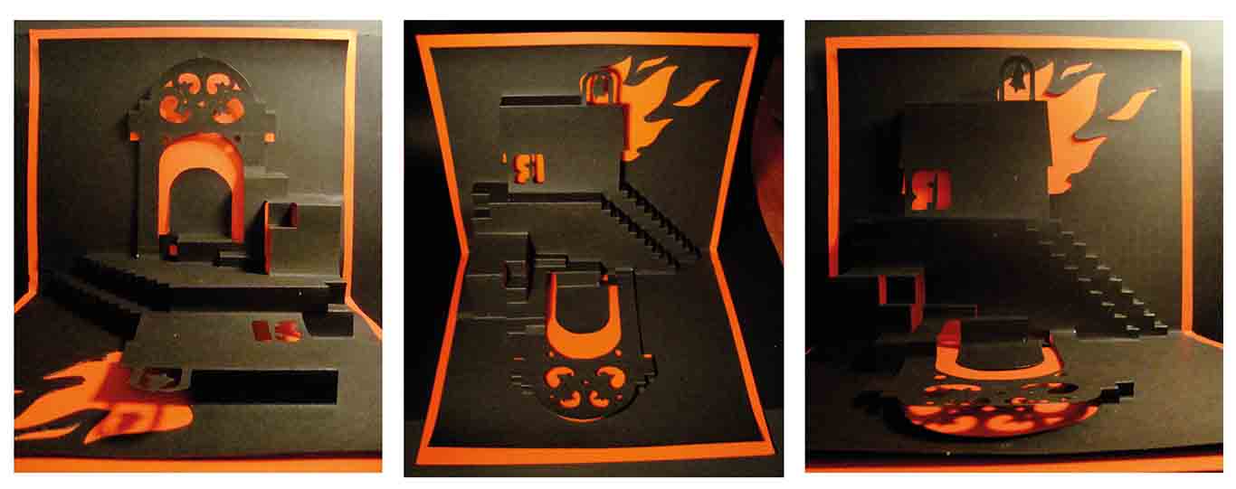
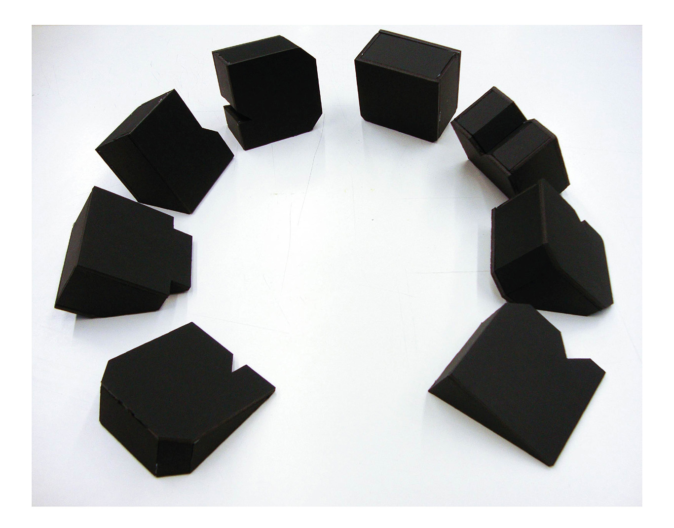
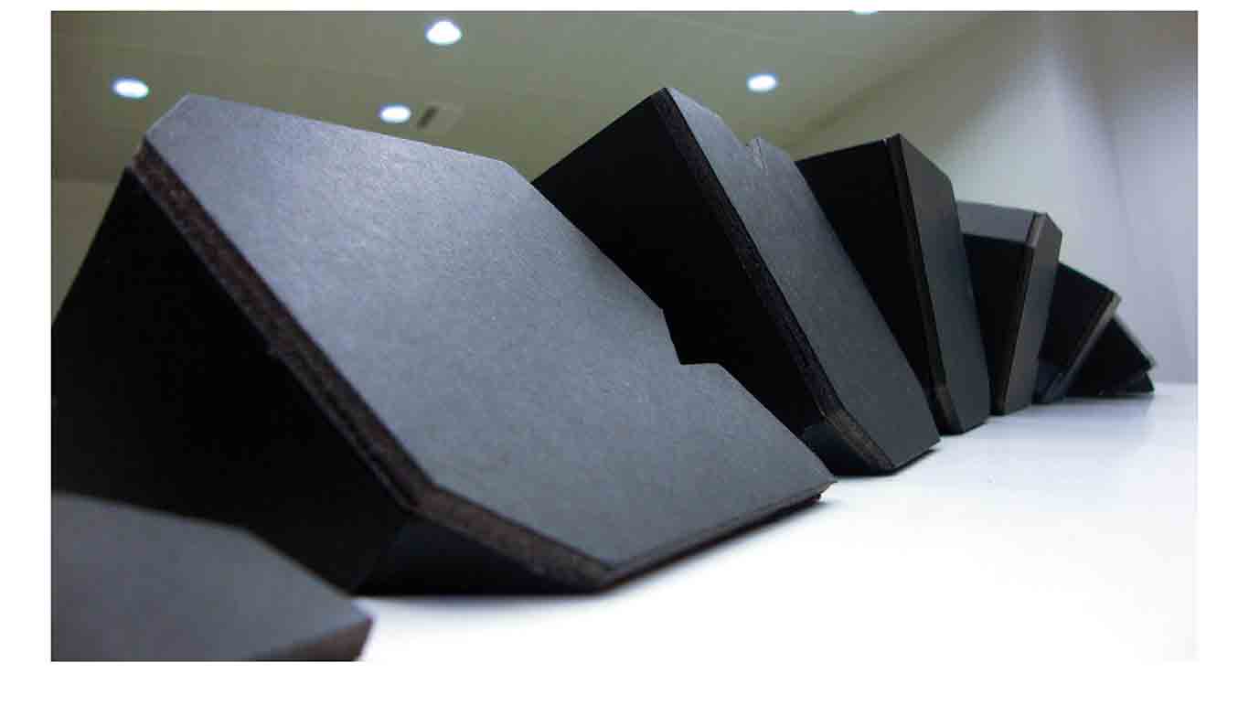
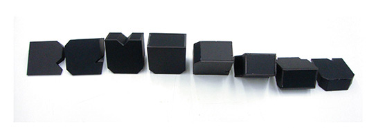
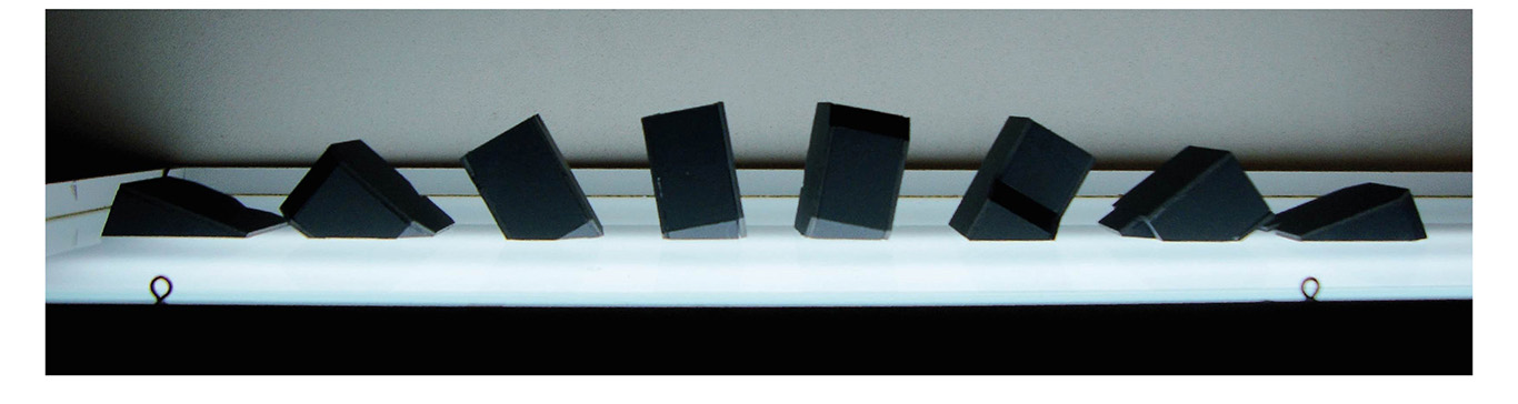
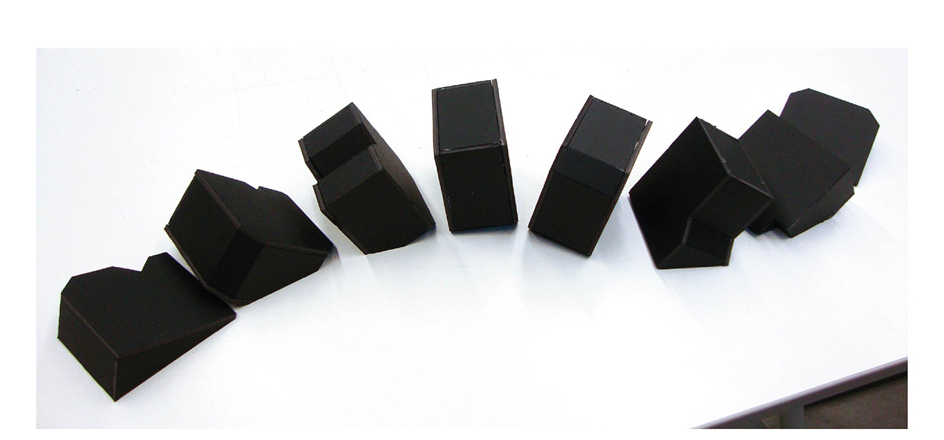
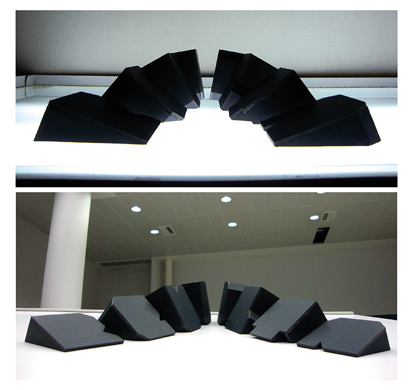
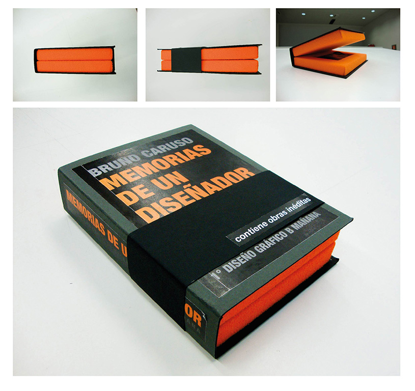
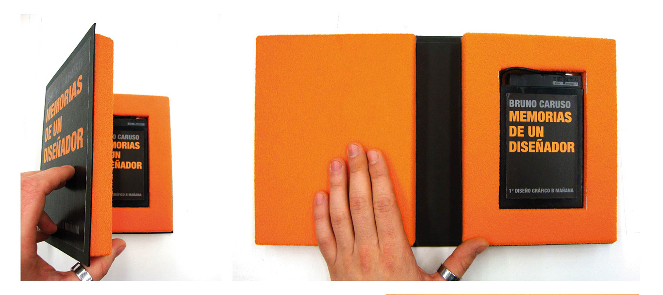
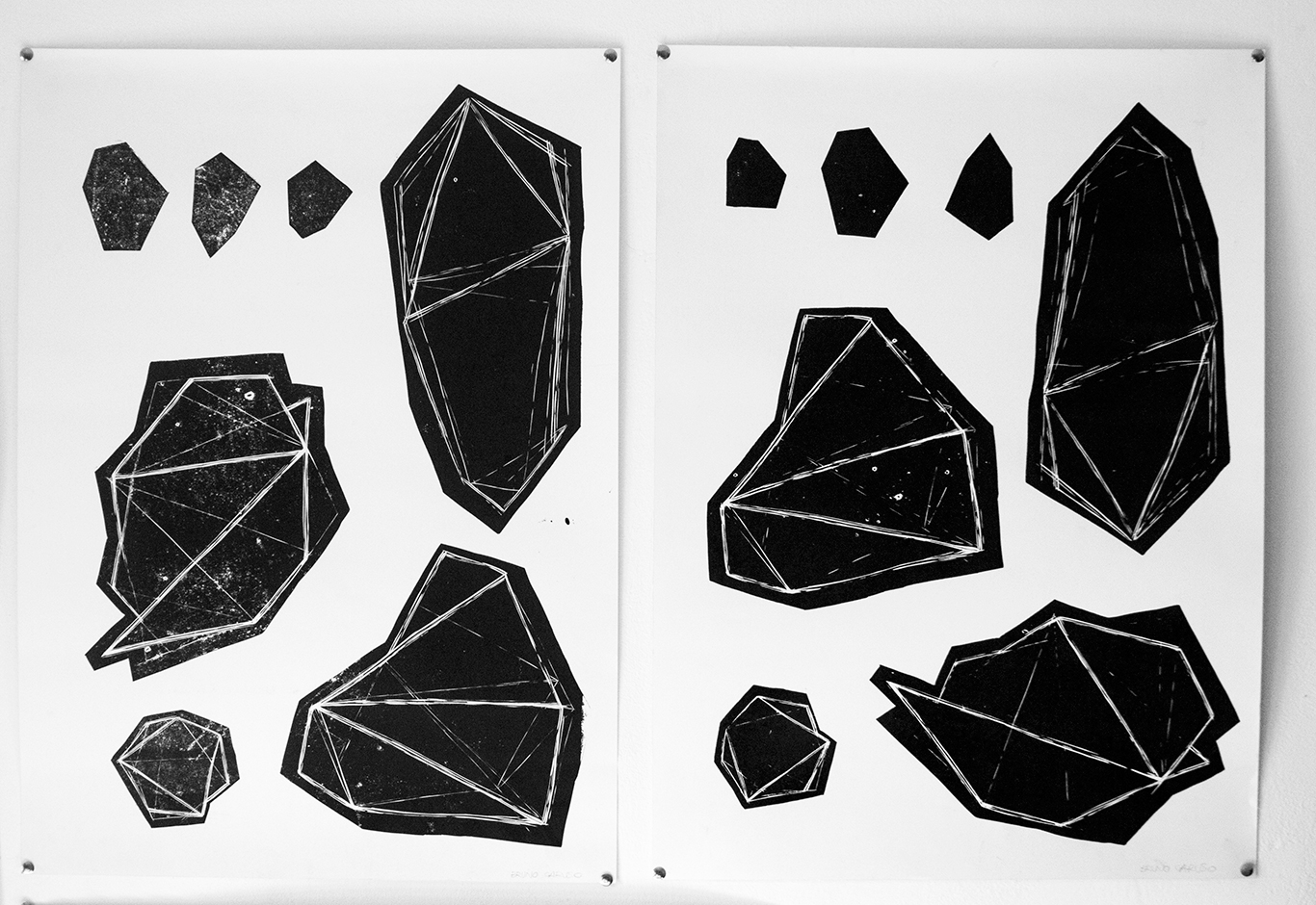
Volumen
Studio about the form and and the evolution in space based on typography, sacred geometry, packaging and pop up. It seeks harmony of these elements through the radial, linear, circular disposition. // EASD Valencia. -
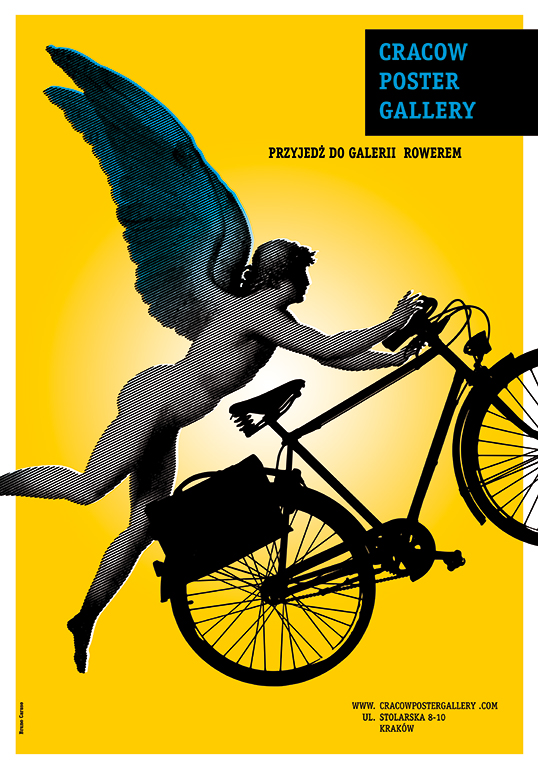
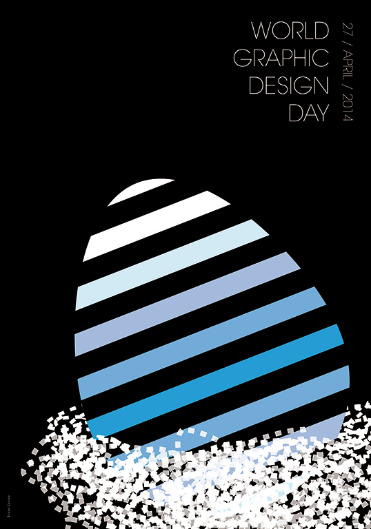
Polish Poster
Working in the class of Piotr Kunce, I created many poster to advertise events, places and religions !!! Looking for a sinthetic and strong message. // Academy of fine arts “Jana Matejki” Krakow. -
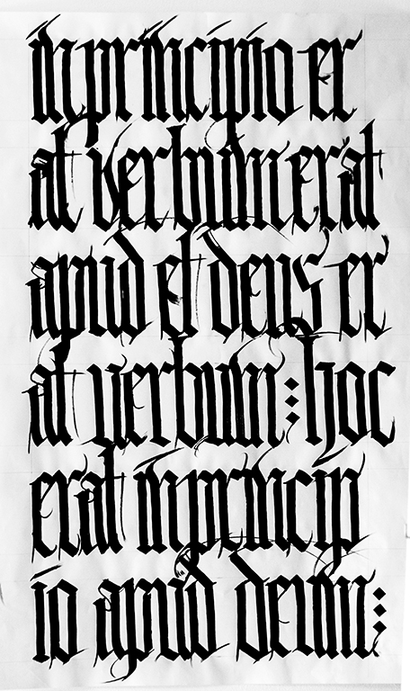
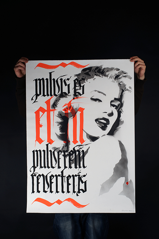
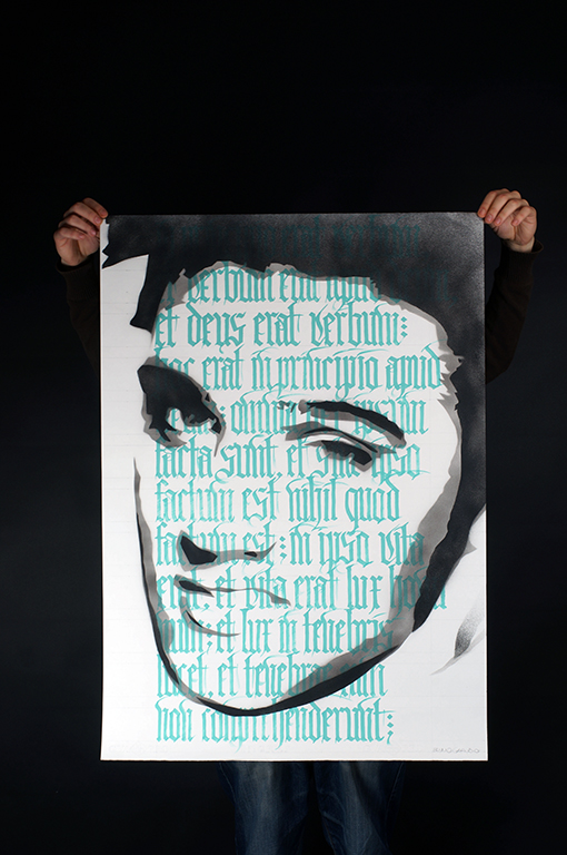
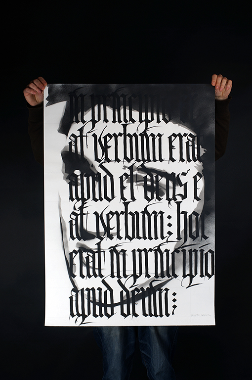
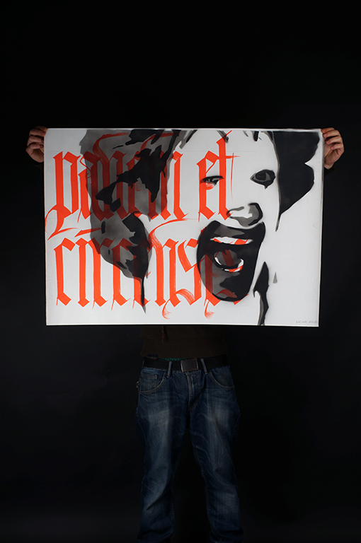
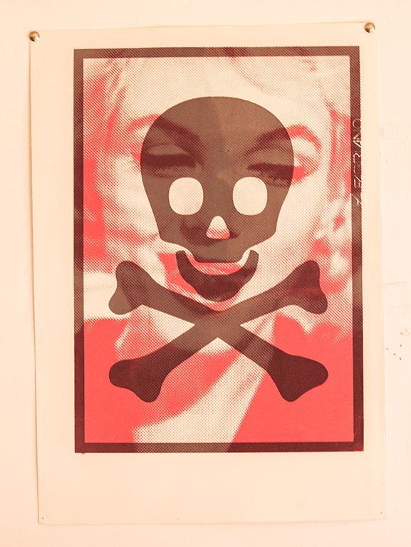
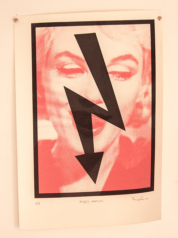
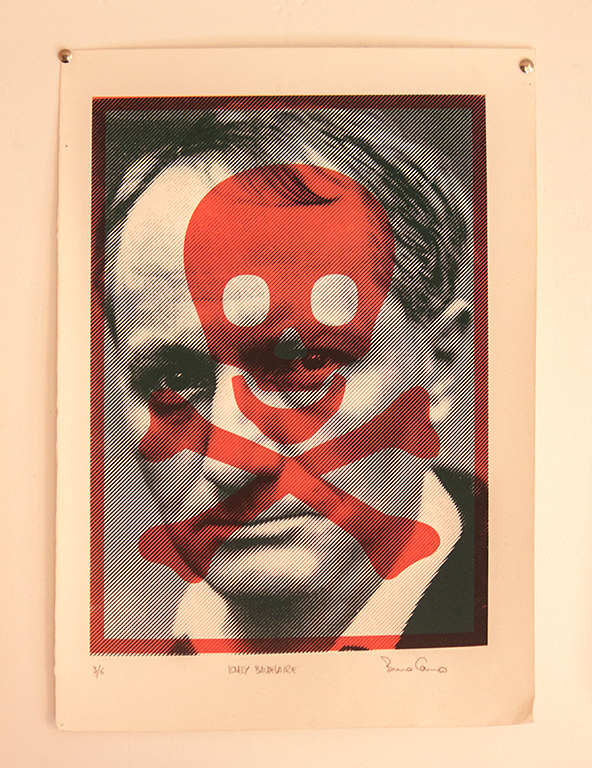
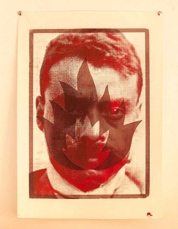
Dies irae dies illa
In this exercise the piece shoulded be composed by illustrations and calligraphy. I choosed to create a contrast between classic culture and pop icons, using stencil and calligraphy techniques. // Easd Valencia -
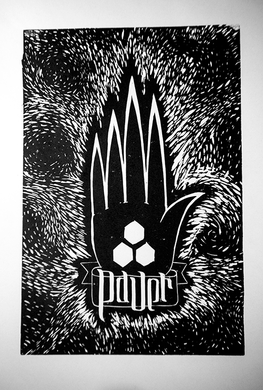
Pauer
Some exercises of lynocut ad silkscreen, representing the abstraction of form and his perception. // Academy of fine arts “Jana Matejki” Krakow.
Caruso Bruno
web portfolio